Google, for the unaware, is currently busy theming and redesigning the logos of its workspace apps so they adhere to the company’s logo colour scheme – red, green, yellow, and blue.

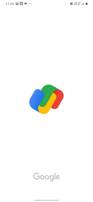
While apps like Gmail, Drive, Meet, etc. have already received a logo redesign, a user recently spotted that Google Pay too is getting a new logo. Twitter user Sumanta Das shared pictures of the new logo on social media.
And honestly, we don’t like it. Ittu sa bhi nhi. And though Google Pay might have a whole lengthy explanation about its new design, still nope, maaza nhi a raha.

Also Read: Inside 10 Most Stunning Palaces In India That Would Take You Back In Time
To what we gather, the logo has the blue and yellow ‘u’ representing the ‘G’ and the green and red ‘inverted u’ that represents the ‘P’ in the Google Pay name. You just need to add a straight line in the middle to complete the letters.
Also to mention, as of now, the new logo has not been officially released as we don’t have an update pending on the Play and App stores. But it might soon make its way to your phone and you might be like:

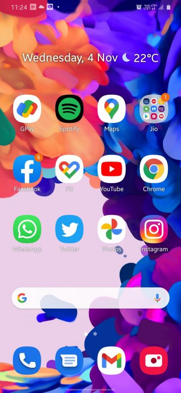
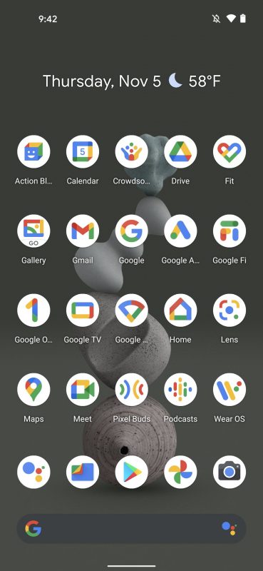
Meanwhile, here are multiple Google apps that have already received a logo redesign.
Also Read: It’s Snow Falling In North India & These Pics Of The Same Would Make You Wanna Go There
So people logo kesi laagi? A gaya swaad?